
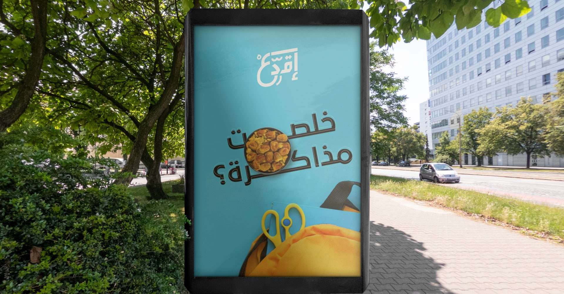
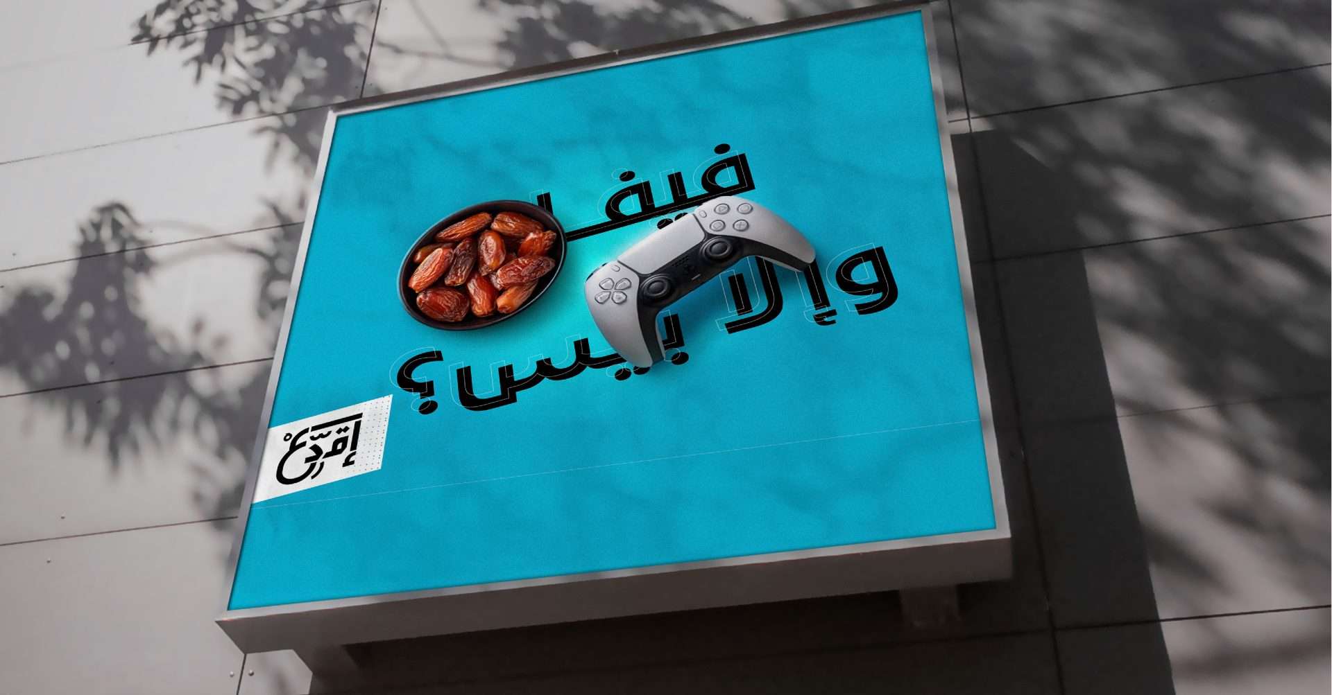

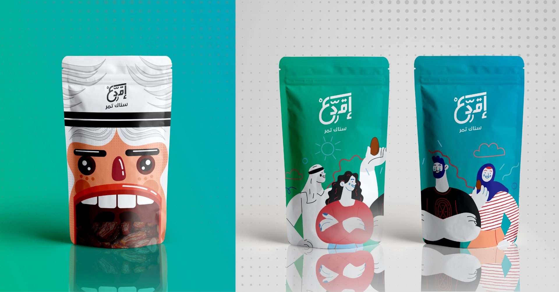
Recognizing the importance of appealing to the younger generation, our designs focused on incorporating vibrant colors and eye-catching elements. We carefully selected a palette of bold and energetic hues to create an atmosphere of excitement and positivity. These colors not only capture attention but also evoke feelings of vitality and well-being, aligning perfectly with the campaign’s goal of promoting the nutritional value of dates.
In order to convey the message effectively, our designs seamlessly integrated enticing visuals of dates. Through skillful illustration and photography, we showcased the various forms and textures of dates, highlighting their natural beauty and inviting appeal. These visuals were carefully balanced with engaging typography that emphasized the campaign’s key messages, such as the health benefits, versatility, and delicious taste of dates.
The designs and posters created for Eqda’s branding campaign were strategically crafted to resonate with the target audience. By incorporating youthful and contemporary elements, we aimed to establish a connection with the younger generation and ignite their curiosity about the many benefits of including dates in their daily routine.
Through our branding design efforts, Eqda’s promotional campaign successfully captured the attention of the youth and instilled a sense of excitement and interest in incorporating dates as a nutritious snack option. The colorful and vibrant designs not only conveyed the campaign’s message effectively but also created a visually engaging experience that left a lasting impression.
We are proud to have contributed to Eqda’s mission of promoting healthy eating habits among the youth and fostering a positive relationship with dates as a nutritious and delicious snack choice.